Friday, 22 October 2010

Evaluation.

Evaluation.


   My college magazine uses many conventions by having a model on the front cover taking up most of the page. The tagline is underneath my magazine title in the masthead, Unconventionally my title is in the centre of my cover unlike most magazines where it is in the left hand corner. There is also a cover line in the lower right hand corner, showing there is more content in the magazine and making the audience want to carry on reading and reading more articles. My magazine does not have a barcode as the other college magazines that I researched did not have one on, and where usually free.

My college magazine ‘sixth style’ targets all students this particular issue mostly targets first years, as it tries to help new students adapt to sixth form live as A levels are a big jump up from GCSE’s. The magazine is for all types of students, this is why on the cover a student is featured instead of a teacher or a parent. The students are represented positively as they are seen as nice hard working students and are not seen to be up to no good.

I included stories that have an influence on the students working lives and their social lives, such as Wyke’s Halloween party and learning and revision tips. I also used a young student so the audience can relate to the story and apply the story to their lives.

While I have been doing this project, I found that the blog website we used was easy and clear to understand and that it was useful and helpful to our project and it became so much easier than creating a large portfolio that has to be carried around and as I am not very creative this helped improve the quality of my work. Even though doing this project helped improve my Photoshop skills I still feel there is a lot I need to learn as I still struggle to use the programme. There is lots more I would like to achieve with this project and further project but I still feel I do not have enough experience or knowledge of the programme.


Final Front Cover.

Front Cover.


Final Contents

Contents Page.


Final Cover Analysis Using L.I.I.A.R

Final Cover Analysis Using L.I.I.A.R
Language - The picture shows a girl who is writing, showing you that she is a hard working student. The colour of her vest top is the same colour of the glow around the letters. The story about the Halloween party has a ghostly glow around it and the use of the word disappear adds to the Halloween theme and ghosts. The model is represented in a positive way as they are smiling, and they obviously enjoy the work they are doing. The cover is conventional as the tagline is in a smaller font under the title, I placed the masthead in the centre of my cover.

Institution – Wyke is a sixth form college that promotes the idea of respect equality and fair treatment. It respects the idea of learning and tries to get the best out of it’s students. Most of the students are 16 – 19. This is why on the cover I used a young model as this represents the students who are the target audience of my magazine.

Ideology – Wyke presents the idea of positive learning on the highest standard. Every one is taught to respect and treat everybody fairly. And Wyke is proud of its sports teams and it’s high pass rate.

Audience – The audience of my college magazine is the students of Wyke, The target age range is 16 – 19 year olds. 50% of Wyke students live in Hull, However the other 50% live in the East Riding.

Representation – The students in my magazine are very positive, as they are all happy and working hard, They are not shown partying or causing trouble which may give them a negative representation.     


Draft Cover

Draft Cover

This is my draft cover I did on the computer with Photoshop,. I chose not to use this one as at the bottom, all of the text was the same font and size and also the same colour and it looked very boring. I also had no room to put any more strap lines. Also the main picture was two small and the headline in my opinion did not stand out enough, But near the arm in my picture it looked blank and bare but there was still not enough room to fit in any stories.


Final Image

Final Image

I finally chose this image as it mostly portrays what my cover story was trying to say. It shows that how people should now that they have moved to sixth form should take care of their own learning as they are now given more freedom and respect. The learning and homework demands are much greater then school and some find it hard to adjust the purpose of my magazine is to help people cope with this dramatic change and give them learning and revision tips.


Unused Photo's.


Image One – This is were my model is stood at the board, this is to fit in with the cover story. ‘be your own teacher’

Image Two – This is another angle I have taken, to help cover the main story.

Image Three – This is a picture of the building, this helps the audience establish where this picture has been taken and to help the magazine.

Image Four and Five – This was to help cover one of my strap lines of my magazine ‘new building oak opens’

Image Six – This shows a picture of the Ash building, this is to also show where my college magazine is for.

Image Seven – This shows the audience where abouts wyke I ma talking about.

Image Eight – This is an establishing shot, showing the areas of wyke college.

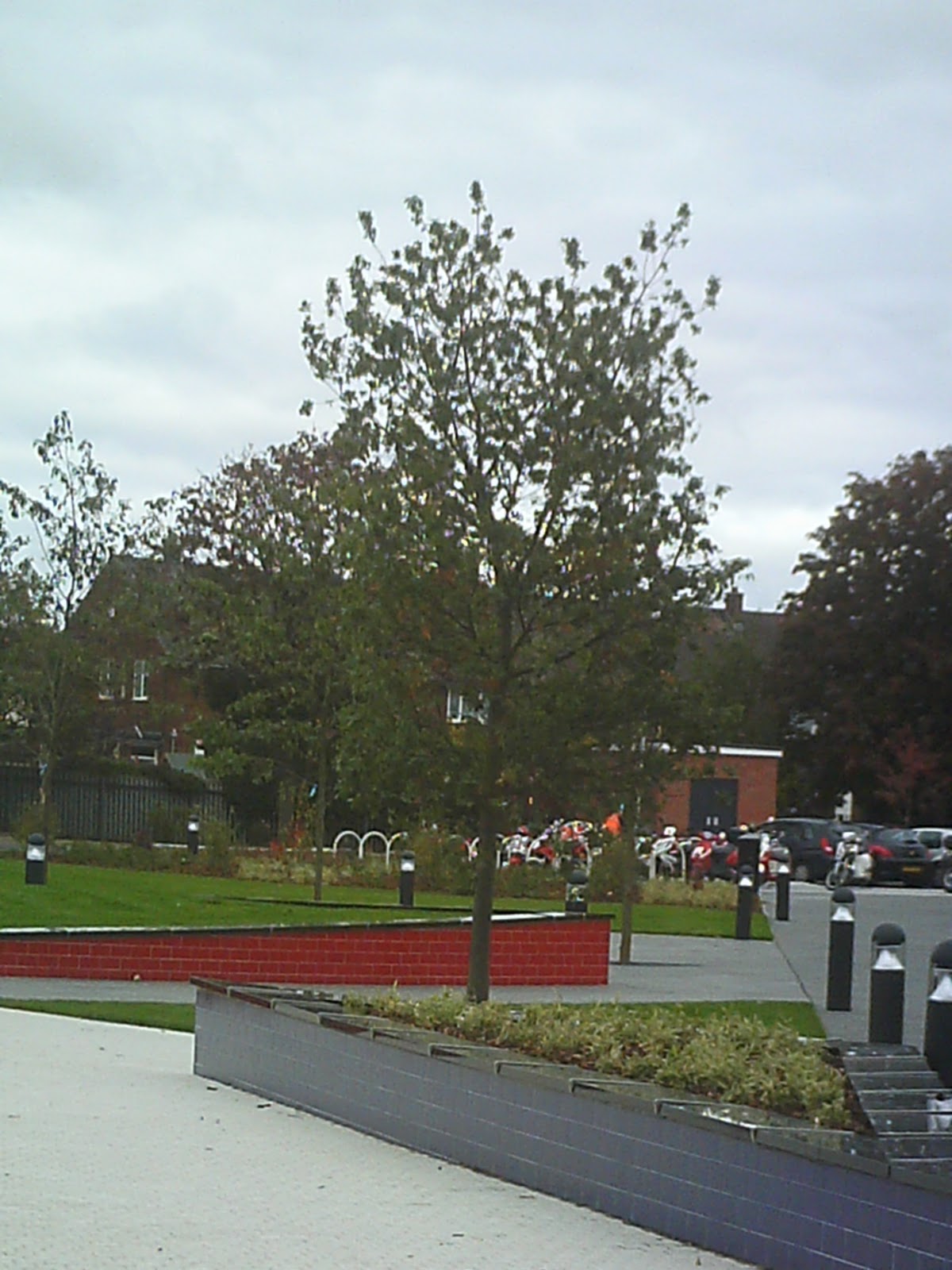
Image Nine and Ten – These pictures where to show the new garden area that has been built in the college.