Friday, 18 February 2011

My Final Pieces

These are all of my final pieces of work for my media magazine ...

  • My Front Cover
  • My Contents Page
  • My Double Page Spread
  • My 2nd Double Page Spread


    This is my front cover. 'AMP. Issue 313. January 2011'
    This is my contents page, I have now center aligned the date and website so it fits in with the rest of the contents page. I have also made page six into the number instead of the word so it fits in with the rest of the contents page, and follows a theme.
    This is my double page spread. 'That I am submitting for marking'
    This is my 2nd double page spread. 'this is for my benefit to show the whole extent of my article and to show my magazines consistency'

Other Examples Of My Double Page Spread

These are the other variations I have tired whilst trying to complete my double page spread ...

I though this worked well, however I felt it took some aspects of the picture away. Also I like having the words 'the only exceptions' in the top right hand corner as I wanted this to be a running trend through out my magazine.


On this picture I liked that it said 'the only exceptions' at the top in the centre, But I was missing the fact that the headline had gone over the picture. I also couldn't find a suitable colour to make sure it was clearly visible over all of the picture.

I felt on this one most of the text was close and squished together, I didn't like the fact that not much of the article to fit in and I couldn't get the next question in as it was too large.

Tuesday, 15 February 2011

My Improved 2nd Double Page Spread

To improve my 2nd double page spread, I have added page numbers in the bottom corners as this is what you would find in an actual music magazine and these numbers are also consistent with the numbers written on the contents page. As my main double page spread would be pages six and seven, therefore as this is the follow on of the article these pages are eight and nine ...

Monday, 14 February 2011

My 2nd Double Page Spread

As my whole article did not fit on to my actual double page spread I have produced a simple 2nd one, to show my full article and to show the trends that would carry on throughout my magazine and it's articles ...

Improved Contents Page

This is my improved contents page. I have added page numbers to the remaining pictures and also added page numbers for the rest of the articles featured on the contents page ...

I think this now looks more professional scince I have added the page numbers.

Friday, 11 February 2011

Final Double Page Spread

Since my last shot I have been changing the position of the headline for the story, and changing the size of the text until I think it looked like a professional magazine. This is my final double page spread ...


I think this works well, as in my opinion it looks like a professional article, also it has the small captions that catch the readers eye, this makes them want to read the article as the caption interests them.


Tuesday, 8 February 2011

Introduction to my article

This is the introduction that is placed on my double page spread before the Q&A session with the band. It is written like the person who has interviewed the band has written it and is given the audience an overview of how the day of the interview was ...

We got the girls into our studio to ask them the questions you all wanna know. So on the 21st of January I asked the girls to come down to our London studio. I organised the interview for 12 o’clock, however they wanted it for 3 o’clock. (Rough Night) Thank God these girls are still down to earth as this is the first interview in years were we’ve sat and munched on biscuits and chocolate while chatting. I usually have to stick to a diet of salad and flavoured tea while speaking to some of the other stars as they need to keep their stick thin figures. I enjoyed this interview as the girls were great, and we had a good laugh, as they still seem real and normal ... Just like us I guess. Enjoy! Kyra x

Double Page Spread - Step Three

This is the third shot of my double page spread. I have added a brief introduction to the article. It appears to be in the words of the interviewer (me), so when the audience read it they feel more connected to the magazine and the article. I have seen examples of this in magazines such as NME ...

I added an introduction to my article, this is so when my audience read the article they feel like they have a connection with the band but also the person who is writing it.

Double Page Spread - Step Two

This is the second shot of my double page spread, I have added the bands name in the right hand corner, if I was to produce more articles for my magazine this trend would follow throughout. I have also added the headline for the double page spread ...

I think this works well, as I have seen this style of magazine article before in other magazines throughout my research.

Double Page Spread - Step One

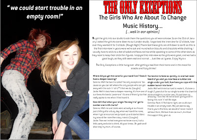
This is my double page spread. So far I have chosen the picture I am going to use this is once again an energetic picture to keep with the theme of the cover and contents page. I have placed it where I want it and I have also added a caption to the picture. That is actually a passage from the double page spread that's why it has been placed in quotation marks, the caption ...

I think this picture portrays the energy I am trying to keep throughout my magazine. Also one of the band members is keeping eye contact with the audience, and it keeps the idea of a party theme.

Thursday, 3 February 2011

Improved Front Cover

This is the improved front cover, of my music magazine. After feedback I have decided to rid of the items in the background of the picture so it isolates the artists and makes them the main attraction for the reader and I have changed the masthead so it stands out more. I think these changes have made my magazine look better and look more professional ...


Wednesday, 2 February 2011

Final Contents Page

This is my finished contents page, I have added a banner at the bottom of my page, saying to subscribe as I found that this featured in many of the magazines I researched, and as it says that the reader saves money this will make the reader subscribe if they are a frequent reader and making more people pick AMP then other magazines ...


This is my final contents page, however I have noticed that I have forgotten to add page numbers, and also forgot to add page numbers to the pictures in the bottom corner.


Tuesday, 1 February 2011

Contents page - Step Four

This is the fourth shot of my contents page, I have added more pictures as when I was researching contents pages they always seemed to feature many different pictures of the artists who were going to be featured in the magazine ...


I have added two other pictures in the lower contents with their own captions, it works well as the readers can look at the picture and recognise the artist and then quickly read the caption and see what the article is about, and then decide if they want to see it.

Contents Page - Step Three

This is the third shot of my contents page, I have added the reviews that my magazine will conduct and also the features that appear in my magazine every month ...


I have stuck with the theme of having the title of the contents section in red and the same font as the masthead, I have also made the words 'in the spotlight' bigger so they stretch across the space and looks like a title and similar to the title above, and so they make more of an impact to the reader.


The reasons why ...

The reasons why I chose to add 'single/albums reviews' to my magazine is because this is what got the most votes in my poll. I also added an 'your letters' section as after my research with my polls I found out my audience enjoy reading this section ...

Single/Album Reviews
  5 (41%)
 
Editors Letter
  0 (0%)
Gig Guide
  1 (8%)
 
Alternative Download Chart
  1 (8%)
 
Your Letters
  2 (16%)


Contents Page - Step Two

This is the second shot of my contents page, I have now started to add the features of this weeks magazine and also other story lines that will be in my magazine ...


I think this works well as the words 'features' and 'in the spotlight' are in the same font as the masthead, they are also in the same colour, showing consistency. I think it works well as the font is quite odd and distinctive, which is a trait of indie style. As they font is distinctive the magazine will be easily recognised in shops next to all the other magazines. I have also added a caption to 'the only exceptions' photograph so the readers are able to read a quick snippet of information and are able to decide if they actually want to read the article or not.